 In my opinion this picture is about a family who have met after a long time. I actually like this piece of work, because of contarts between hot and cold colours. Agnes Decourchelle's work is really colorfull, and it is definetly not boring. I guess she was trying to make the illustration happy, because she mainly used warm colours like yellow or red. However I think it is summer, as she used a yellow colour for the doors, so its like the sun is shaning. By looking at this picture I can tell Decourchelle used watercolour pencils, also her work is done really detailed, bright and sketchy.
Tuesday, 23 October 2012
Agnes Decourchelle
In my opinion this picture is about a family who have met after a long time. I actually like this piece of work, because of contarts between hot and cold colours. Agnes Decourchelle's work is really colorfull, and it is definetly not boring. I guess she was trying to make the illustration happy, because she mainly used warm colours like yellow or red. However I think it is summer, as she used a yellow colour for the doors, so its like the sun is shaning. By looking at this picture I can tell Decourchelle used watercolour pencils, also her work is done really detailed, bright and sketchy.

Frank Gehry
 Raised in Toronto, Canada, Frank Gehry moved with his family to Los Angeles in
1947. Mr. Gehry received his Bachelor of Architecture degree from the University
of Southern California in 1954, and he studied city planning at the Harvard
University Graduate School of Design. Mr. Gehry has built an architectural
career that has spanned four decades and produced public and private buildings
in America, Europe and Asia.
Raised in Toronto, Canada, Frank Gehry moved with his family to Los Angeles in
1947. Mr. Gehry received his Bachelor of Architecture degree from the University
of Southern California in 1954, and he studied city planning at the Harvard
University Graduate School of Design. Mr. Gehry has built an architectural
career that has spanned four decades and produced public and private buildings
in America, Europe and Asia. After studying architecture at the University of Southern California and
spending a year at the Harvard Graduate School of Design, Gehry established his
own architecture office in 1962, in Los Angeles. Ten years into his career,
Gehry launched the value-based Easy Edge chair series constructed from laminated
cardboard.
After studying architecture at the University of Southern California and
spending a year at the Harvard Graduate School of Design, Gehry established his
own architecture office in 1962, in Los Angeles. Ten years into his career,
Gehry launched the value-based Easy Edge chair series constructed from laminated
cardboard.
Monday, 22 October 2012
Gerrit Rietveld


Monday, 1 October 2012
Michael Craig-Martin
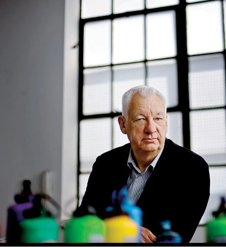
Born in Dublin in 1941, Michael Craig-Martin studied at Yale University School of Art and Architecture in the early 1960s, but has spent most of his working life in Great Britain. Since that time he has shown in numerous solo and group exhibitions both in Britain and internationally, including the definitive exhibition of British conceptual art, The New Art, at the Hayward Gallery (1972).
 The impact Michael has had on the world of art is obvious. From 1974 to 1988, Michael instructed art at Goldsmiths College, London.Michael has a long and impressive list of accomplishments in the world of art: He has served as a Trustee at the Tate Gallery, has done installations for the Projects exhibition series at The Museum of Modern Art, New York (1991) and the Centre Pompidou in Paris (1994), and has created major wallpainting installations at the Kunstverein Hannover (1998) and at the Württembergischer Kunstverein Stuttgart (1999).
I did my version of Michael Craig-Martins work by using colour pencils. I actually didnt enjoy this piece of work and this artist, because in my opinion the things he is drawing are boring, and I dont get any feelings and thoughts why did he draw that and why did he used this colour like I hve when I did other artists work in the class.
Thursday, 27 September 2012
Mr. Brainwash
 Thierry Guetta known as Mr Brainwash is a French street and
pop artists. He also is the moniker of Los Angeles based filmmaker. Mr Brainwash
became famous through his association with famous street artists Banksy and
Shepard Fairey, which was chronicled in the 2010 documentary ‘Exit through the
Gift Shop’.
Thierry Guetta known as Mr Brainwash is a French street and
pop artists. He also is the moniker of Los Angeles based filmmaker. Mr Brainwash
became famous through his association with famous street artists Banksy and
Shepard Fairey, which was chronicled in the 2010 documentary ‘Exit through the
Gift Shop’.
I think Mr Braiwash work is about making people smile and happy,
because this is what it’s all about. A lot of people criticize his work, but by
showing his work he wants to say that if you work hard enough and follow your
heart then nothing is impossible.
 My favourite piece from the exhibition is
called ‘Life is beautiful’, because it is really colourful, in the background
you can see different characters and pieces of Mr Brainwashes work and its
really positive be the words ‘Life is beautiful’ and the sign ‘Love is the
answer’ holding by Albert Einstein.
My favourite piece from the exhibition is
called ‘Life is beautiful’, because it is really colourful, in the background
you can see different characters and pieces of Mr Brainwashes work and its
really positive be the words ‘Life is beautiful’ and the sign ‘Love is the
answer’ holding by Albert Einstein.
I really enjoyed Mr Brainwashes exhibition
and I do like his work, because he is inventing something new and unique. Some
of the work really made me laugh like Barrack Obama in a Superman costume or
Mona Lisa with a machine gun, because as they are serious and important
characters, he tried to make it funny. By this I think he wants to tell people
that you just can’t take everything seriously. However I saw a painting with a
monkey holding a spray can writing ‘Follow your dreams’ and this is exactly why
I like his work. This is the first artists I saw making this really clear
message to his audience.
Sunday, 23 September 2012
Kara Walker

Kara Walker was born in November 26th 1969 in Stockton, California. At the Rhode Island School of Design, she began working in the silhouette form. In 1994 her work appeared in a new-talent show at the Drawing Center in New York. Her work caused a stir. In 1997 she received a John D. and Catherine T. MacArthur Foundation “genius grant.” Her work was exhibited in galleries and museums worldwide.
 Kara Walker's work explores the raw intersection of race, gender, and sexuality through iconic, silhouetted figures.
 Here is my version of one of Kara Walker's work. The longest part while making it was painting. I used black acryling paint and a brush. I have also done it negative, to make it a little bit different. I enjoyed making this piece of wark as this is a first artist I saw making her work completly unique e.g. using only black nad white coulours. However its not easy to say whast it is actually about.
Monday, 17 September 2012
Si Scott
Firstly let me tell you something about Si Scott.
He is an English graphic designer who is originally from Leeds. He studies a BTEC in graphic design in Leeds College of Art and Design, and a foundation in visual communication. After he finished college he decided to go to Buckinghamshire Chilterns University in order to get him Graphic Design degree.

The usual routine of Si Scotts work is most of the time start by picking the font, then trying to imagine how it will look and play around with different page layouts. When he adds more details to it, and trying to make it look unique and by getting the inspiration from music and especially the lyrics it comes really easy. The next phase is to just bring the piece to life using fineliners to create the illustration. The last part is to make the work bigger by scanning it when it is decreased to the original size its clear and easy to read. The last part is to make the work bigger by scanning it when it is decreased to the original size its clear and easy to read.

Here is my own version of Si Scotts work, which i was asked to do for my graphic project. I was trying not only to copy the artist but also give something from myslef, my own idea. I simply used pencil as it is just a begging. Then I will scan it on the computer and play around using e.g. different colours by using Photoshop.
He is an English graphic designer who is originally from Leeds. He studies a BTEC in graphic design in Leeds College of Art and Design, and a foundation in visual communication. After he finished college he decided to go to Buckinghamshire Chilterns University in order to get him Graphic Design degree.
The usual routine of Si Scotts work is most of the time start by picking the font, then trying to imagine how it will look and play around with different page layouts. When he adds more details to it, and trying to make it look unique and by getting the inspiration from music and especially the lyrics it comes really easy. The next phase is to just bring the piece to life using fineliners to create the illustration. The last part is to make the work bigger by scanning it when it is decreased to the original size its clear and easy to read. The last part is to make the work bigger by scanning it when it is decreased to the original size its clear and easy to read.

Here is my own version of Si Scotts work, which i was asked to do for my graphic project. I was trying not only to copy the artist but also give something from myslef, my own idea. I simply used pencil as it is just a begging. Then I will scan it on the computer and play around using e.g. different colours by using Photoshop.
Subscribe to:
Posts (Atom)